Packaging
Make the object part of the story
Develop packaging concepts and artwork around the identity, product and practical production requirements agreed with your suppliers.

Carry your brand into the things people see, hold and interact with. We develop packaging, motion, campaigns and print applications with a clear idea at their centre.
What we do.
The medium changes; the character should remain recognisable. We consider how an idea behaves in a physical object, a moving image and a campaign.

Motion & animation
A visual identity has a character. Motion gives that character rhythm, expression and a way to unfold over time.
For Luminous Minds, the brief called for a school mental health platform that felt warm, supportive and human. Its soft-edged illustrations bring that emotional tone into the brand’s visual language.
Inside Luminous Minds ↗We define the motion language, animation assets and required formats around your project.
Make the object part of the story
Develop packaging concepts and artwork around the identity, product and practical production requirements agreed with your suppliers.
Give the message a clear expression
Develop a creative direction and coordinated assets around an audience, message and agreed set of channels.
Carry the details into the world
Extend the identity into printed materials, signage and other applications, preparing agreed artwork for the relevant production workflow.
We agree the methods, deliverables and responsibilities around your brief.
How we work.
Frame
From the first question to a considered result.Clarify the message, audience, format, production constraints and existing brand language.
An agreed creative and production brief.
Explore
From the first question to a considered result.Develop creative directions and show how they could work across the required applications.
A selected direction for the required applications.
Craft
From the first question to a considered result.Refine the chosen direction, materials, artwork or motion through agreed review stages.
A resolved set of creative assets.
Deliver
From the first question to a considered result.Supply the scoped assets and specifications, coordinating with production partners where agreed.
Production-ready files in the agreed formats.
Creative in practice.
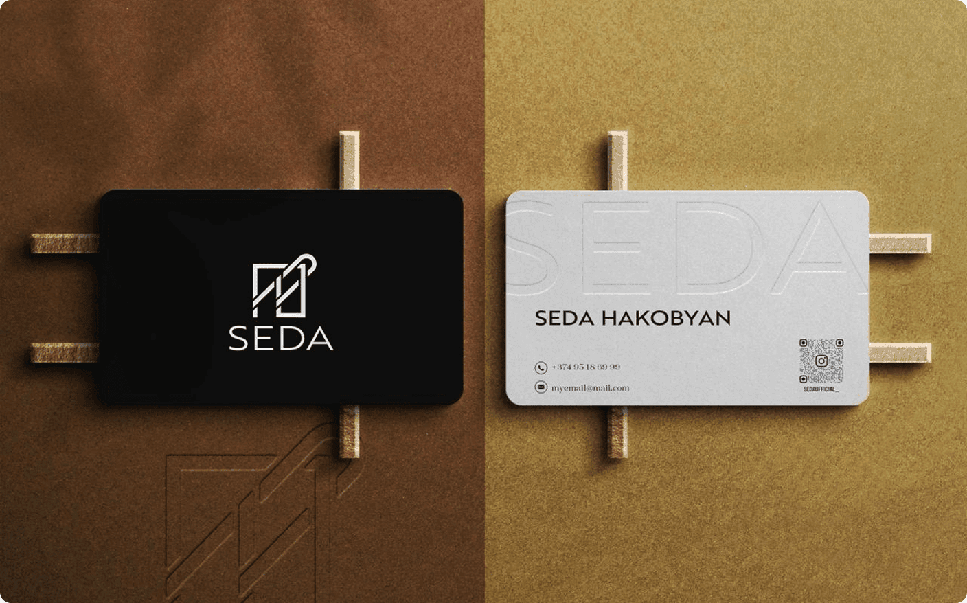
SEDA’s fashion identity carries its needle-and-thread idea into brand applications. Printed details and physical materials extend the same visual language beyond the logo.
The founders’ S and H initials become a needle-and-thread symbol. That idea continues through hang tags, tissue paper, care cards and tote bags, with restrained typography and considered materials.
Explore the case study ↗Before we begin.
No need to arrive with every answer.
Yes. We use the existing brand language as the starting point and establish where the new applications need further creative direction.
Production responsibilities are agreed separately. We can prepare artwork and collaborate with suppliers, but manufacturing costs and supplier services are not automatically included.
Yes. We establish a core idea and adapt it to the agreed formats, rather than treating every asset as an unrelated design.
Deliverables, formats and any editable source files are defined in the project scope, alongside licensing and production requirements.