Creating a Minimalist Fashion Identity Rooted in Story and Structure
SEDA is a contemporary fashion boutique defined by clean lines, quiet elegance, and attention to craftsmanship. With a focus on minimalist silhouettes and high-quality materials, the brand needed a visual identity that could reflect its refined design philosophy and founder-led story.
Our goal was to develop a brand system that felt understated yet unmistakable — something timeless in its restraint, but expressive in the details.
Services
Brand identity
Brand positioning
As featured in:
Building a Brand Around Meaningful Minimalism
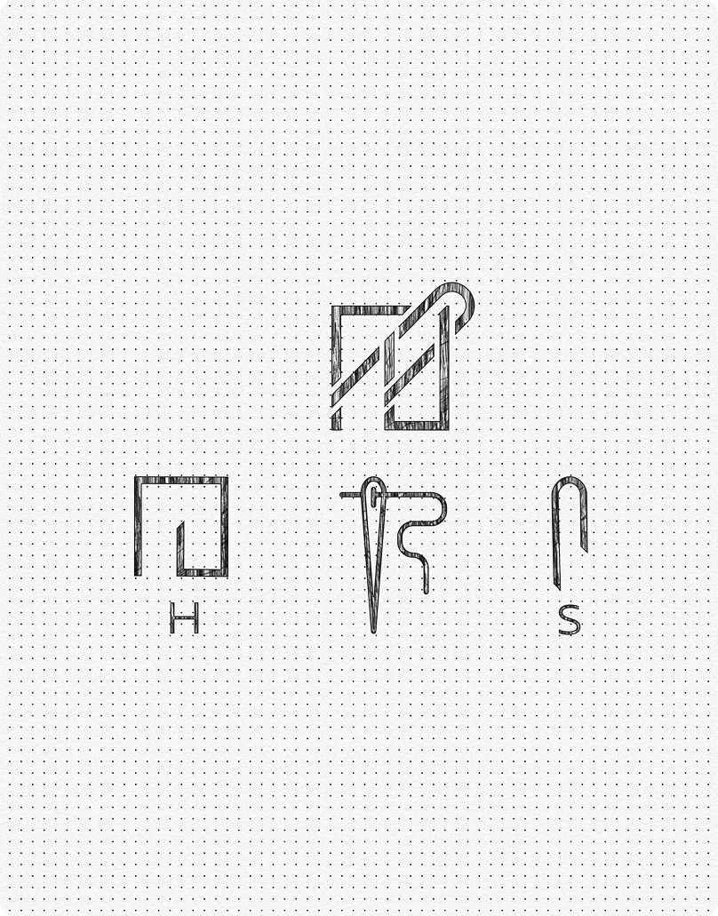
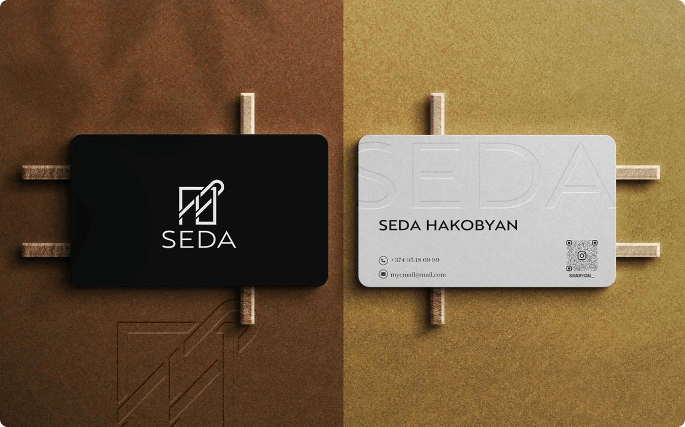
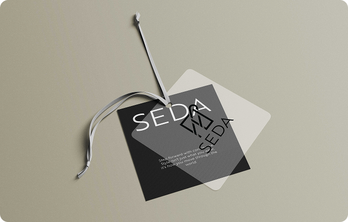
The identity began with the founders' initials — S and H — which we fused into a symbol that evokes a needle and thread. Inspired by the logic of hieroglyphic forms, the mark is built on geometric structure while remaining visually fluid. Black-and-white color usage reinforces the brand's purity, letting garments and craftsmanship remain front and center.
Creating a Timeless Visual System
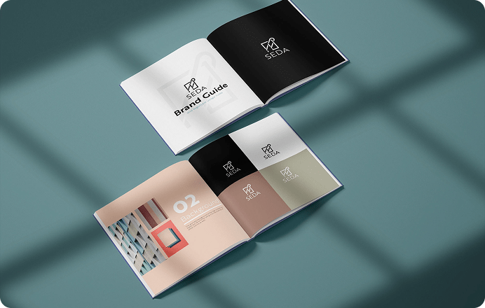
Brand Identity and Logo Creation
Beyond the logo, we developed a full visual identity system that could be used with consistency across digital and physical applications. This included typography pairings that balance legibility and elegance, layout templates with generous white space, and a subtle tone of voice that reflects the brand's soft-spoken luxury.
We also outlined principles for social media, seasonal campaigns, and product announcements, ensuring the brand retained its personality even as it evolved. Whether applied to a website header, a fashion week press release, or an Instagram story, the identity maintains coherence — both functionally and emotionally — across mediums.
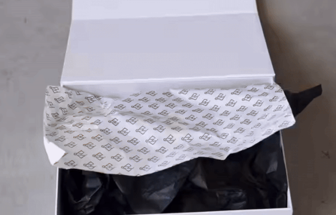
Designing Packaging with Purpose
When form follows function, aesthetically.
Packaging and product labels were treated not as secondary details but as tactile brand experiences. Hang tags, tissue paper, care cards, and tote bags were all designed with material and print techniques in mind — uncoated papers, debossing, edge-painted borders — elements that communicate texture, restraint, and thoughtful design.
Every label and sticker was sized and formatted according to garment categories and user handling, ensuring not just visual consistency but also comfort in how customers interact with the product. These small decisions accumulate to reinforce the perception of care, craft, and deliberate elegance.
Elevating Everyday Luxury Through Visual Clarity
SEDA's final brand system is built to stand the test of time — aesthetically, structurally, and emotionally. It does not chase trends or overstate its presence, yet remains memorable through its clarity, balance, and authorship. It allows the fashion to remain the focal point while supporting the brand's story at every level.
With its refined mark, minimal structure, and soft but confident voice, SEDA now has a visual identity that aligns with its core values — helping it connect more deeply with customers, collaborators, and the culture it's quietly shaping.
See other case studies
Get In Touch
Your story is unique, and we're here to help you tell it—beautifully, boldly, and authentically.
Contact Us© Hypnotica, All Rights Reserved.