

Designing a Mental Health Platform That Feels Supportive, Clear, and Human
Luminous Minds is an Australia-based digital platform dedicated to improving the mental well-being of school-aged children. Built for educators, school counselors, and administrators, the platform equips schools with tools to assess, monitor, and support students’ emotional health in structured, data-informed ways.
Our goal was to craft a complete brand and product experience that would strike a balance between empathy and professionalism. We needed to design a system that could address serious topics like student anxiety and emotional regulation while remaining warm, accessible, and hopeful; a platform that feels like a helping hand, not a clinical interface.
01 / THE IDENTITY
Building a Brand That Communicates Empathy and Clarity
At the heart of the identity is a radiant, optimistic visual language inspired by light, gradients, and emotional warmth. The logo and palette were designed to reflect a spectrum of feelings; using vivid purples, corals, and sky blues to create both vibrancy and balance. The identity is modern and expressive, helping the brand resonate with both students and educators.
Typography, iconography, and tone of voice were all crafted to prioritize clarity and sensitivity. We aimed to make every communication; from buttons to banners to email notifications; feel thoughtful and approachable. The identity doesn’t shy away from emotional complexity; instead, it supports and reassures through structure, design, and care.



Moving Beyond Mental Health Clichés
Brains, hearts and head silhouettes are familiar shorthand for mental health. They make the category recognisable, but can leave very different organisations looking interchangeable. We deliberately moved away from those conventions so Luminous Minds could develop a character of its own.
For a platform supporting children in schools, we wanted the identity to express possibility and emotional warmth. The firefly-inspired symbol brings together ideas of light, hope and connection. Its expressive colours and soft forms give the brand room to feel hopeful and approachable, while the wider visual system provides the clarity educators need.
Designing a Platform for Well-being
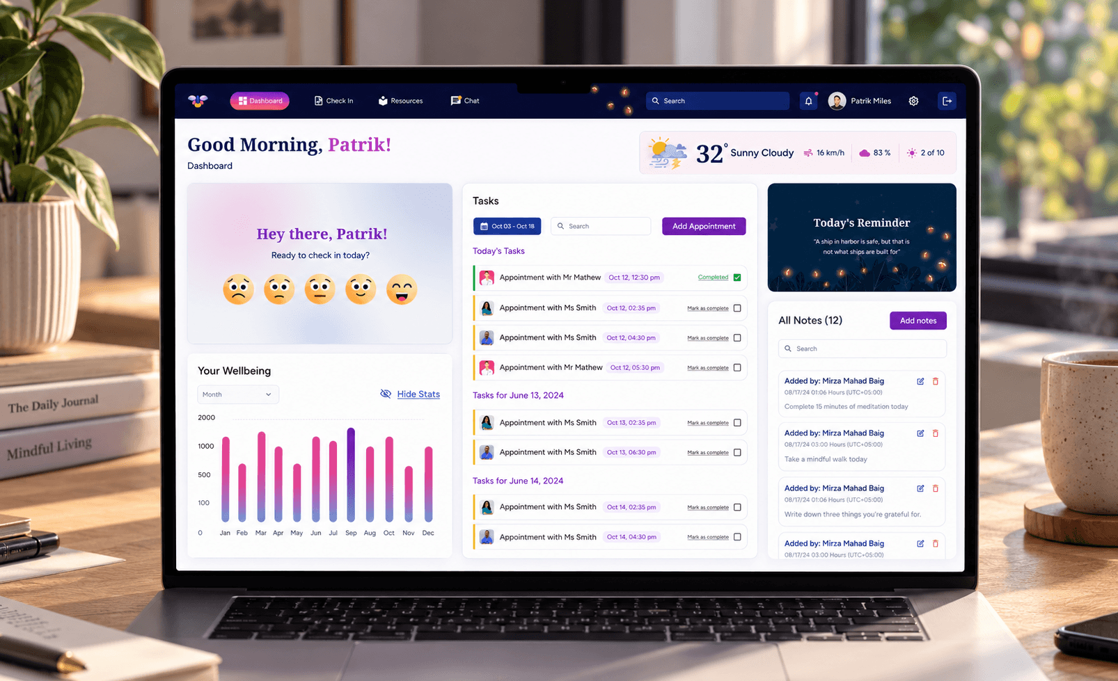
The platform experience is built around streamlined data collection and accessible reporting. Educators can log mental health indicators, track behavioral trends, and provide follow-up interventions with ease. We prioritized clear hierarchies, gentle visuals, and supportive messaging to make potentially heavy tasks feel manageable.

Building a Scalable Design System

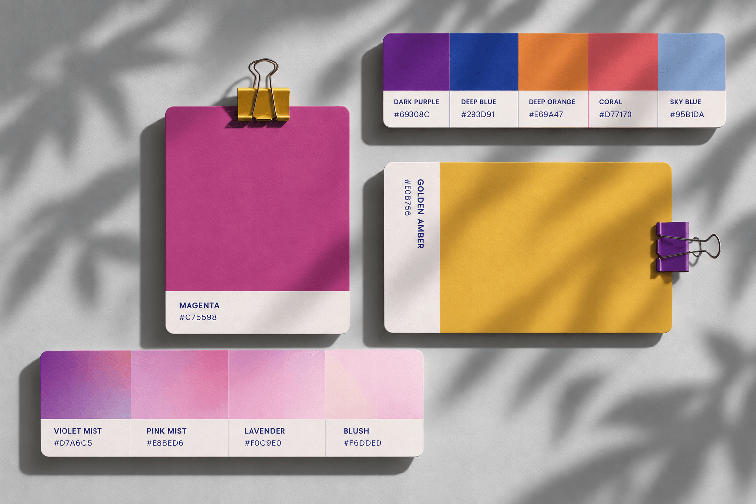
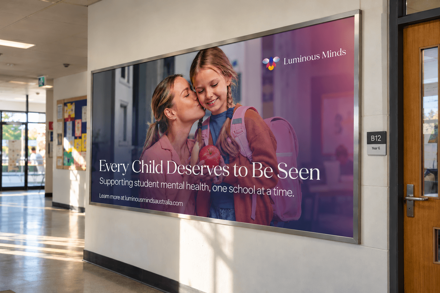
A shared visual language connects the platform to its school communications. The details work together to make each interaction clear, familiar and easy to navigate.
- 01 / CHECK-IN
Five expressions.
A visual mood scale gives the daily check-in a clear starting point.
One simple choice. - 02 / OVERVIEW
Reflection meets
Wellbeing, appointments and notes share a single dashboard.
follow-up. - 03 / IDENTITY
From screen
The same colours and firefly symbol connect the product with its printed communications.
to school.
A Brand That Builds Connection & Trust
The identity and interface system use a shared palette, illustration style and component language across educator dashboards, onboarding and school communications. The work connects a warm public-facing brand with structured screens for check-ins and reporting, keeping the visual tone consistent as people move between communication and daily tasks.
CLIENT PERSPECTIVELUMINOUS MINDS / AUSTRALIA
“There was never an issue with communication or product quality.”
