Hospitality
Meduzza ↗
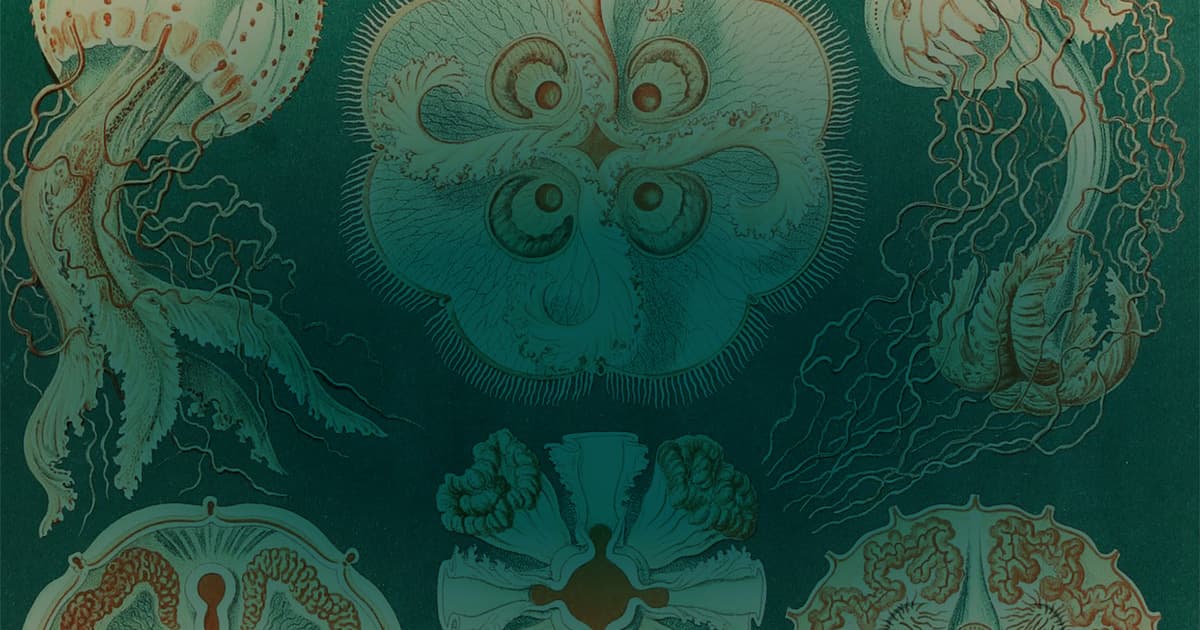
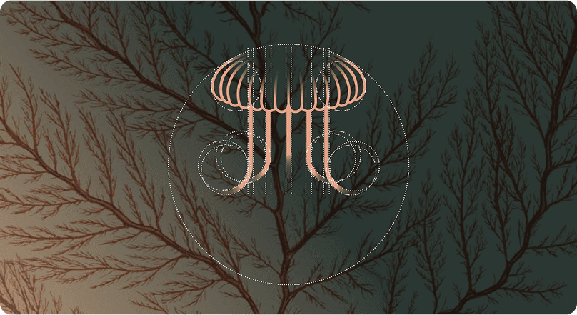
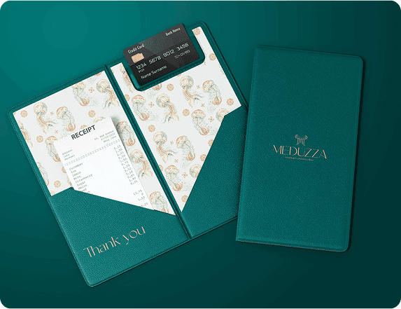
A jellyfish-inspired mark, geometric construction, and deep sea tones extended into Meduzza’s printed and digital touchpoints.

Strategy into expression.
We connect brand positioning with visual identity, language, and the places people encounter your brand—from a digital platform to a printed tag. Every element should have a reason, and belong to the same story.
A shared language.
Your brand is recognised through more than its logo. The words, visual details, and applications need to belong to the same idea.
Explore the elements of an identity system.
We clarify who you are speaking to, what they value, and where your business has something distinct to offer. This becomes the reference point for the identity—not a statement that sits apart from it.
For Meduzza, the lounge’s sensory atmosphere informed a jellyfish-inspired mark, champagne hues, and deep sea tones. The idea carries through the visual system.
Explore Meduzza ↗The right words make your offer easier to understand. We establish the tone, key messages, and language that connect your positioning to the way you introduce your business.
See how clear messaging and content support a logistics platform’s offer.
Explore Ocean ↗A logo is one part of the picture. We develop the mark, typography, colour, and image direction together, so the identity has a consistent character across different formats.
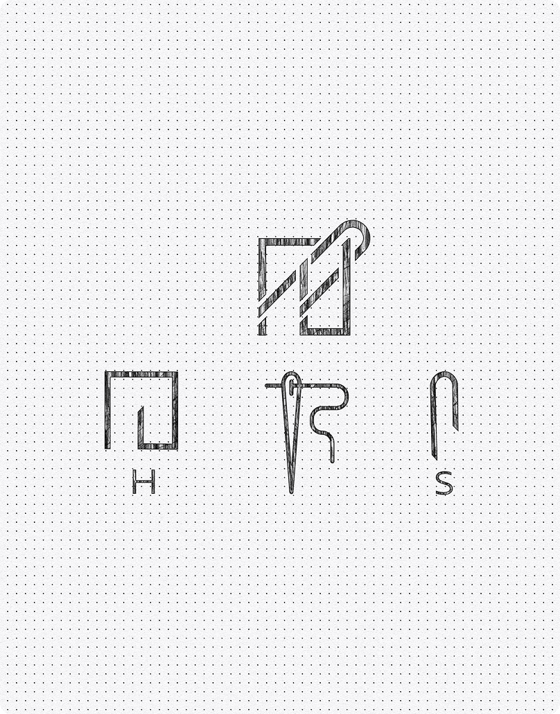
For SEDA, we fused the founders’ S and H initials into a needle-and-thread symbol, then paired it with typography and layouts that leave room for the garments.
Explore SEDA ↗We apply the identity to the touchpoints your business needs. Seeing it in context reveals what needs to stay consistent and where the system needs room to adapt.
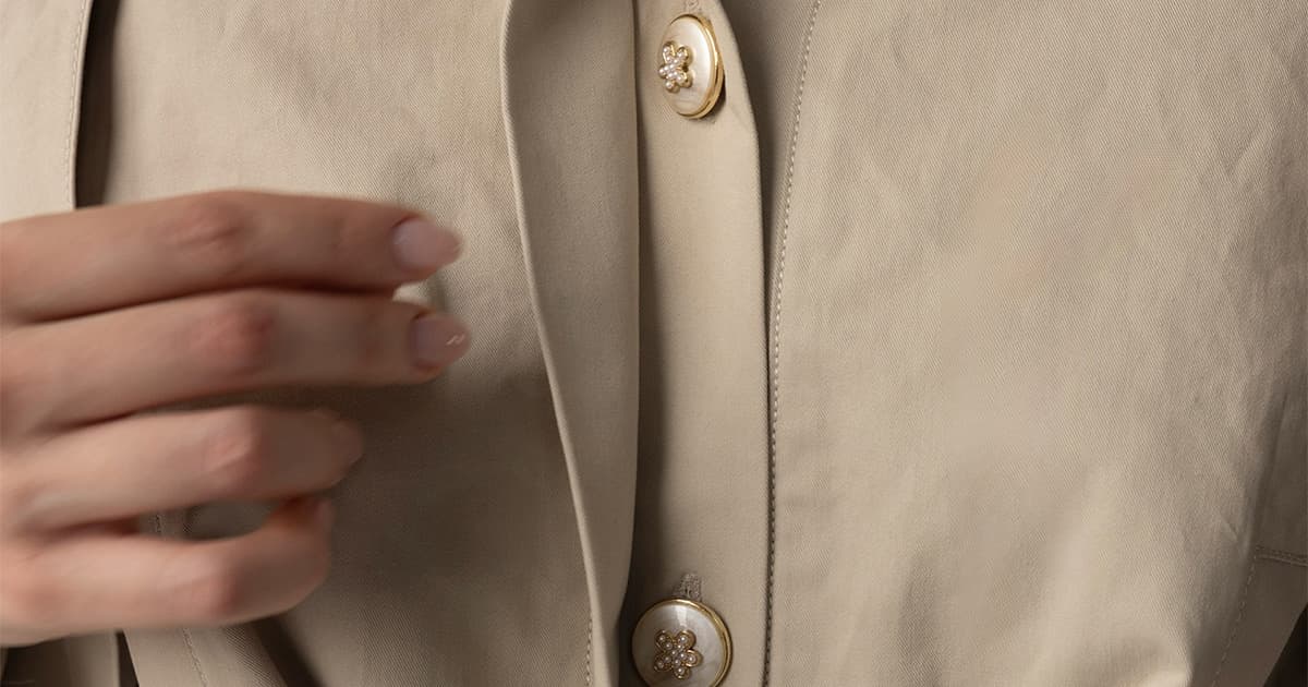
SEDA’s identity extends into hang tags, tissue paper, care cards, and tote bags. Material and print choices are part of the same restrained visual language.
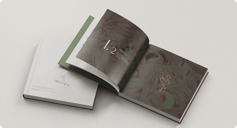
Explore SEDA ↗We document the decisions behind the identity and show how to use its elements. Your team gets a practical reference for making new materials without rebuilding the brand each time.
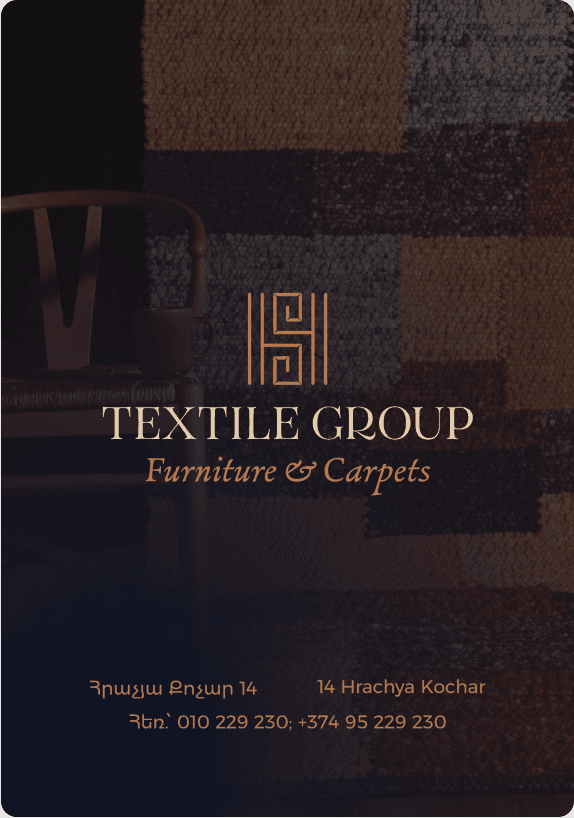
Textile Group’s mirrored monogram, type pairings, and natural palette work across product tags and web-based catalogues. The case study shows how those elements hold together.
Explore Textile Group ↗The elements and applications included are defined in your project scope.
How we work.
Discover
From understanding to expression.We begin with your context: what you offer, who you need to reach, and what is changing. Conversations, existing materials, and a review of your category help us distinguish the real challenge from its visual symptoms.
A shared brief and a clear design challenge.
Define
From understanding to expression.We turn the findings into a focused direction. Positioning, personality, and key messages establish what the brand should express—and give us a reason for every design decision that follows.
An agreed strategic and creative direction.
Develop
From understanding to expression.We explore visual directions, then develop the selected route into a connected identity. The mark, type, colour, and imagery are tested together on relevant applications, so the system works beyond a presentation slide.
A resolved identity across the agreed touchpoints.
Deliver
From understanding to expression.We prepare the agreed assets and document how the system works. Clear files, usage guidance, and application examples help your team carry the identity into everyday work with consistency.
An organised identity toolkit, ready for your team.
The thinking, made visible.
Hospitality
A jellyfish-inspired mark, geometric construction, and deep sea tones extended into Meduzza’s printed and digital touchpoints.
Fashion
The founders’ S and H initials form a needle-and-thread symbol, carried through typography, hang tags, tissue paper, care cards, and tote bags.
Interiors
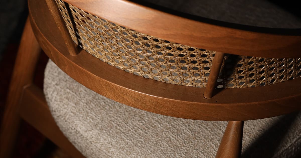
A mirrored monogram that also reads as a chair, paired with serif and sans-serif typography and a system for product tags, catalogues, and packaging.
Before we begin.
No need to arrive with every answer.
These are a good place to start.
01 / Fit
Not necessarily. We start by looking at what still works and where the identity falls short. Sometimes the right move is to keep the mark and build a stronger system around it: typography, colour, imagery, and clearer applications.
Start with what has changed: your offer, your audience, or the way you want to be perceived. We use that context to identify whether you need a focused refresh or a new identity, before deciding what to design.
02 / Scope & investment
We can discuss the touchpoints that matter most now and what can follow later. The aim is a coherent starting point, with deliverables and priorities agreed in your proposal.
We define the work before setting the fee and schedule. Share your goals, required applications, launch date, and budget range. We can then discuss a scope, milestones, and review process that fit the project.
03 / Collaboration & handoff
Your knowledge of the business, access to existing materials, and considered feedback. It helps to have a clear decision-maker and to bring the right people into the conversation at agreed milestones.
The assets and guidance defined in your scope: this may include logo files, colour and typography specifications, brand guidelines, and selected applications. We agree on formats and handoff requirements so the work can move into everyday use.
Something else on your mind?
Let’s talk about it ↗