
It's one of the most common requests we hear. And we get it. A logo is visible, tangible, and easy to point at. Changing it feels like action.
But here's the truth: your logo is the face of your brand, not its brain. If the thinking behind it is fuzzy, a new face won't fix it.
1. People Don't Understand What You Do
A logo can't explain your offer. If prospects need a 20-minute call before they "get it," the issue is your message, not your mark. Start with one clear sentence: who you help, what you solve, and why it matters.
2. You Sound Different Everywhere
Your website says one thing. Your sales deck says another. Your Instagram says something else entirely. A new logo on top of mixed messages only adds one more inconsistency to the pile.
3. You're Always Competing on Price
If customers treat you as interchangeable, they don't see what makes you different. That's a positioning problem. No symbol, however beautiful, can create a difference that isn't defined yet.

4. The Experience Doesn't Match the Promise
Slow replies. Confusing onboarding. A checkout that makes people give up halfway. People judge your brand by how you make them feel, and they feel the gaps long before they notice your logo.
5. You Can't Describe Your Ideal Customer
If your audience is "everyone," your designer is guessing. And a logo designed on a guess will feel generic, no matter how polished it looks.

When a New Logo Actually Makes Sense
We're not saying never redesign. Sometimes a new mark is exactly the right move:
- Your business has pivoted to a new offer or audience.
- Your name is changing, or you've merged with another company.
- Your current logo doesn't work technically (illegible at small sizes, breaks on digital screens).
- Your brand has outgrown its early, DIY identity and it's now costing you trust.
The difference? In each case, the strategy changed first, and the logo followed.
-
What to Do Instead
- Clarify your positioning. Who is this for, and why should they choose you over the alternative?
- Sharpen your message. Turn that positioning into words people can repeat.
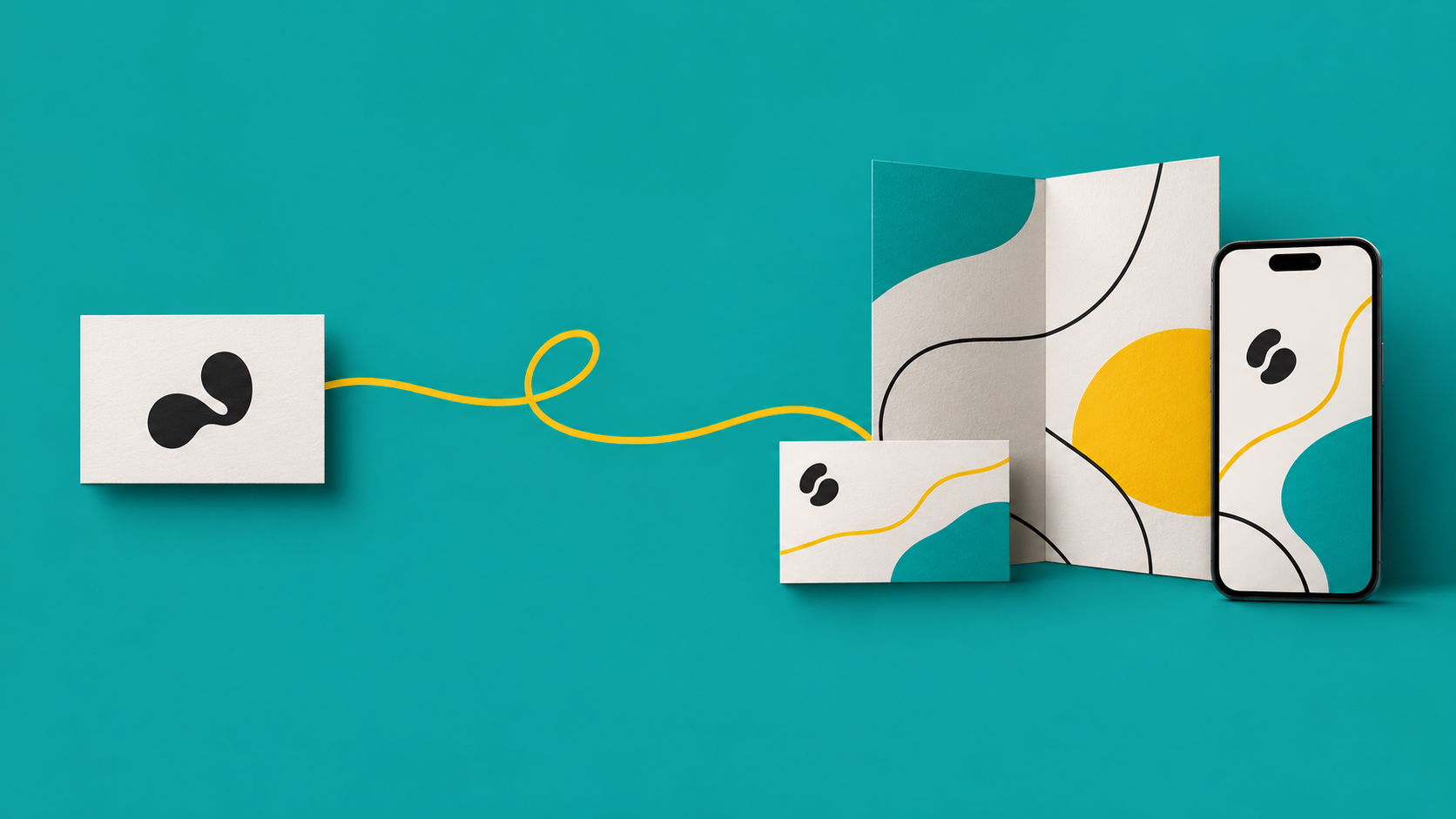
- Build a system, not a symbol: typography, color, tone, imagery, and the logo working together, everywhere.
Do it in this order, and your visual identity has something real to express.
Final Thought
A logo is a signature. It should sign off on something clear, consistent, and worth trusting.
People don't fall for a logo. They fall for what it stands for.
Additional resources:
Explore how we reimagined Textile Group through a strategy-led rebrand, turning a legacy name into a lifestyle-forward identity.
_______________________
More to read:
Check the 7 branding red flags that quietly hurt startups before they even launch.
