

Property Paperwork,
Brought Together
SalesPacker is a legaltech platform that brings property information and supporting documents together into a sales pack. The product gives a detailed administrative process a clear sequence, from entering property details to preparing the pack.
We designed the identity and interface together, connecting a distinctive shield-and-check mark with a practical system of forms, lists and reusable components. The goal was to make a complex process easier to follow without hiding the detail it requires.
01 / THE PRODUCT
A detailed process, one step at a time
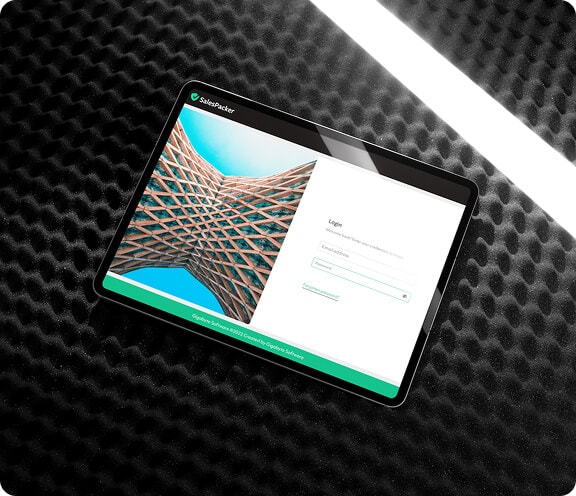
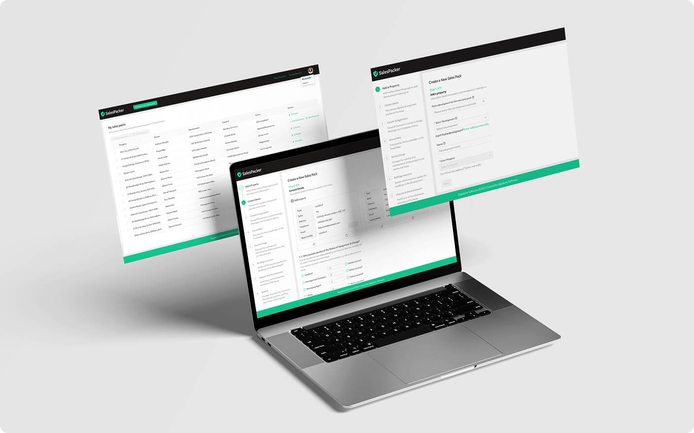
A sales pack brings together information from different parts of a property transaction. We organised the interface around a staged workflow, with a persistent step list to show what comes next. Clear labels, grouped fields and visible status indicators help make that detail navigable.
Creating a Clear and Unified Brand
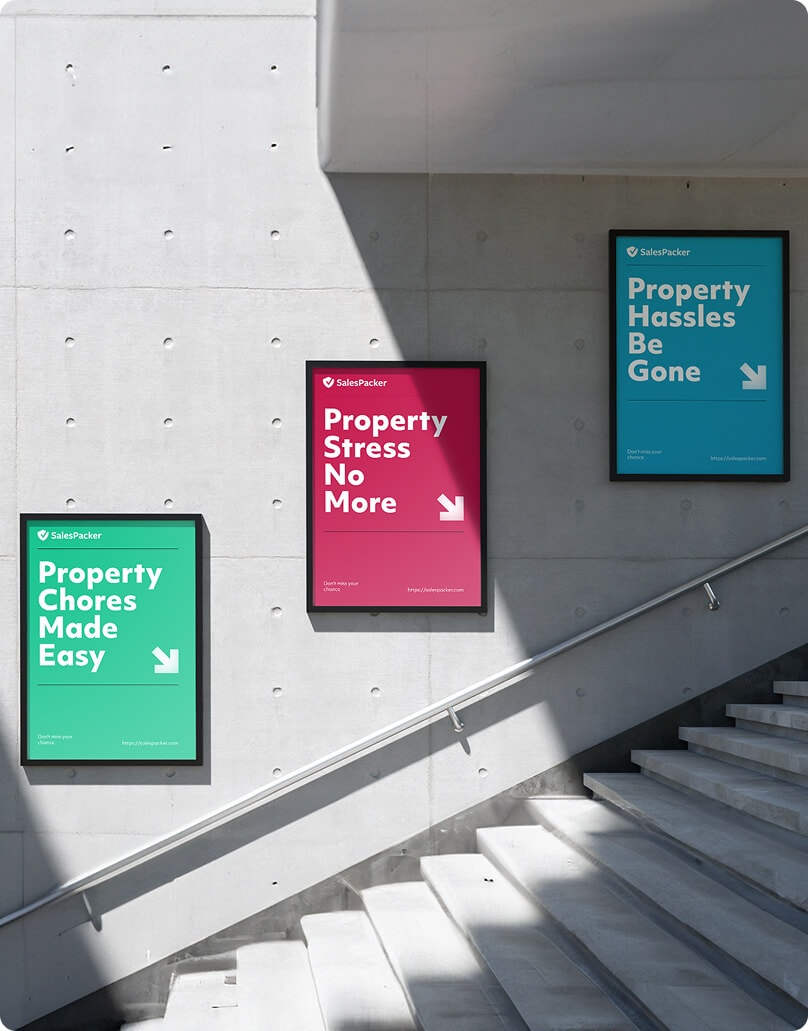
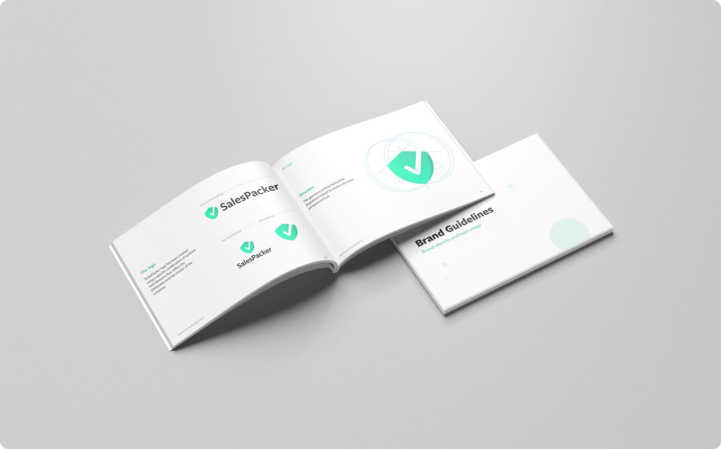
The shield-and-check mark gives SalesPacker a recognisable symbol for protection and completion. Its folded edge adds depth to the geometric silhouette. Caribbean Green provides the primary accent, supported by carmine and Pacific Blue across the wider identity.
Improving Efficiency Through Design
The interface uses the same visual language across lists, forms and pack preparation. Tables provide an overview of existing packs; the step-by-step flow opens up the detail of an individual property. Reusable controls keep the experience familiar as the information changes.
- 01 / ORIENT
See the packs
List views bring property records and available actions into a consistent overview.
and their status. - 02 / COMPLETE
Work through
A persistent step list connects each form to its place in the process.
the property details. - 03 / REPEAT
Familiar controls.
Shared fields, buttons and tables create continuity across the product.
Different information.

CLIENT PERSPECTIVESALESPACKER / GIGABYTE SOFTWARE
“The team delivered a clean, consistent, and professional brand presence and product design that feels cohesive across every touchpoint. We appreciated the thoughtful approach and strong attention to detail.”
