Designing a Handcrafted Visual Identity for a Creative Photography Studio
Flamingo is a lifestyle photography studio built around capturing personal, joyful, and aesthetically refined moments. With a creative sensibility rooted in storytelling and artistry, Flamingo needed a brand identity that could embody both emotional warmth and visual sophistication.
We set out to create a brand that felt artistic but structured, refined yet personal — something that would be equally at home on digital portfolios, printed photo sets, and across the studio's growing presence.
Services
Brand identity
Brand positioning
As featured in:
Creating a Brand That Feels Handcrafted and Expressive
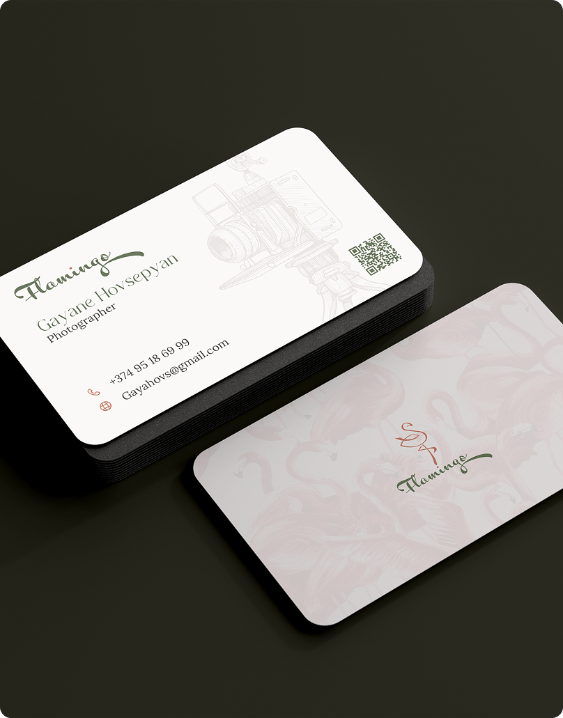
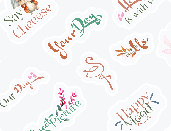
At the heart of the Flamingo identity is a calligraphic logo inspired by master ink strokes — fluid, elegant, and full of character. Though visually freeform, the mark is underpinned by golden ratio geometry, giving it structure without sacrificing expression. The flamingo symbol subtly ties back to the studio name, adding a playful nod within an otherwise refined look.


Creating a Calm Visual Identity
Brand Identity and Logo Creation
We extended the logo into a broader identity system grounded in visual calm. The primary color palette is made up of soft earth tones — pastel khaki, muted orange, and cultured grey — which evoke natural light, quiet spaces, and serene moments. These tones work across print and digital assets, helping to create a brand presence that feels both inviting and elevated.
Type selection paired a modern serif with a playful cursive, creating a dynamic hierarchy that balances clarity with charm. We developed design rules for photography overlays, layout proportions, and visual rhythm that preserve legibility without losing warmth.
Extending the Brand Through Print
Bringing the Identity to Life Through Printables
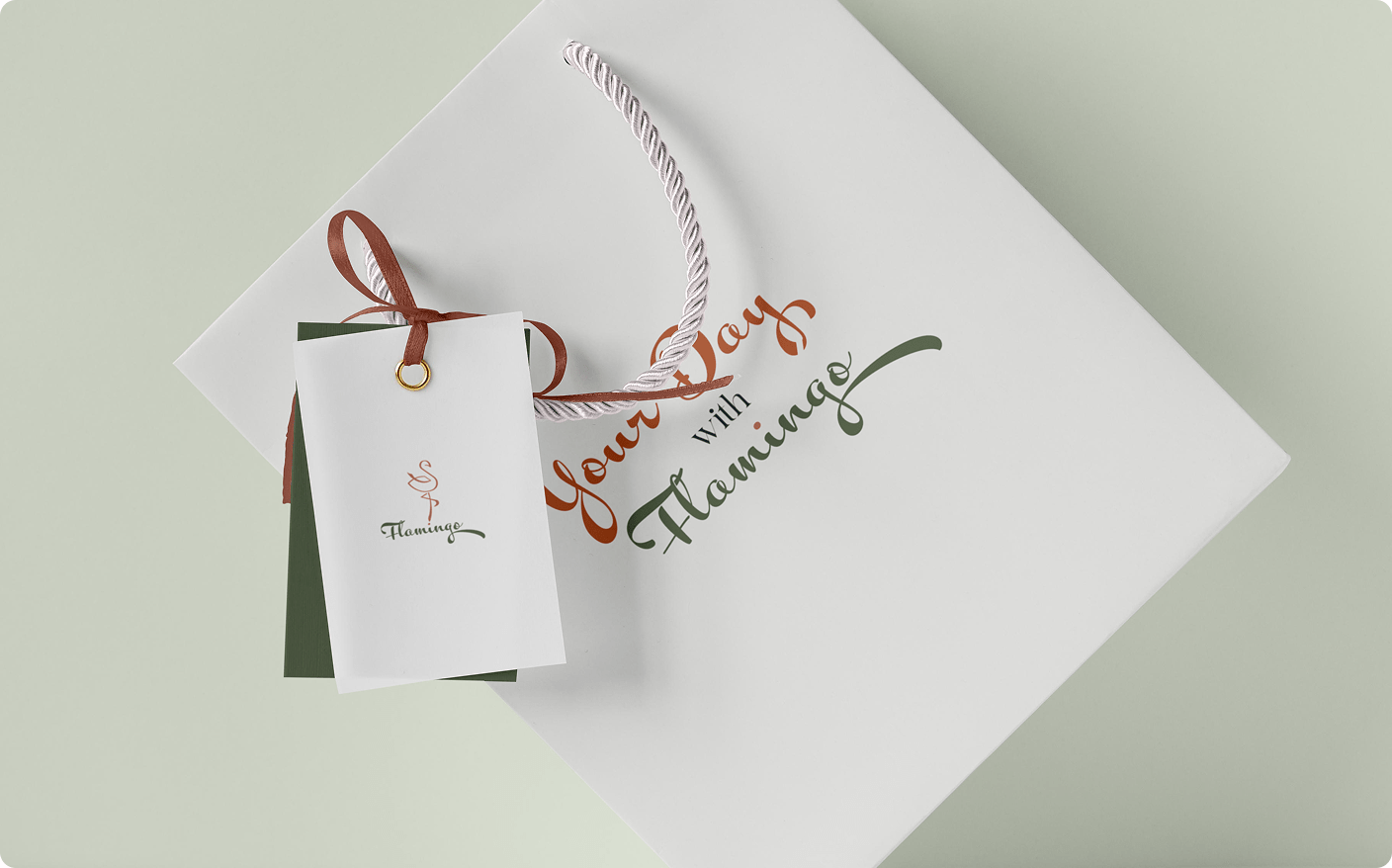
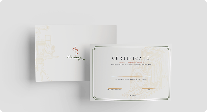
We crafted a flexible and thoughtfully curated suite of printable assets — including gift cards, personalized photo boxes, print release forms, care instructions, and handwritten notes. Every element was designed with the same sensitivity and attention to detail as the studio’s photography itself. These pieces embody the brand’s calm, elegant tone and help bridge the emotional connection between photographer and client. By extending the experience beyond the photoshoot, these tangible materials create lasting impressions and allow the Flamingo brand to be felt, remembered, and appreciated long after each session ends.
Applying the Identity Across Print and Digital
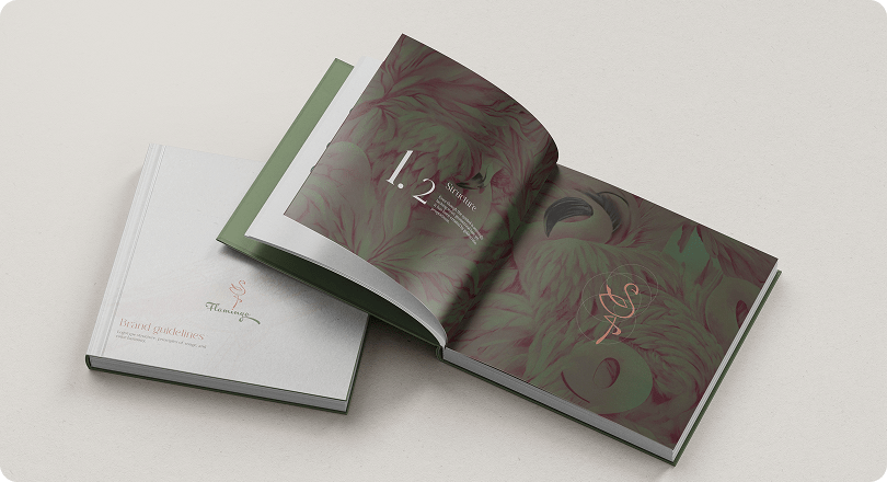
To ensure consistency and integrity across every touchpoint, we built a set of adaptable layouts and practical brand usage guidelines. These were applied to watermarking systems, digital portfolios, online galleries, printed collateral, and social media templates — each carefully adjusted to support both clarity and creative tone. This system allows Flamingo to evolve and expand with confidence, all while staying true to the brand’s intimate, handcrafted essence. The result is a toolkit that supports growth without ever compromising the sense of artistry and personal connection that defines the studio’s work.

Crafting a Brand That Captures Emotion
The completed brand system offers Flamingo a fully realized identity — one that feels deeply cohesive, emotionally resonant, and true to its founding values. From its expressive logo to the curated palette and tactile print elements, every part of the system is aligned to communicate trust, warmth, and refined creativity. This identity not only enhances the studio’s commercial credibility but also protects its personal, artistic essence — enabling Flamingo to grow as both a business and a creative practice without compromise.
See other case studies
Get In Touch
Your story is unique, and we're here to help you tell it—beautifully, boldly, and authentically.
Contact Us© Hypnotica, All Rights Reserved.